QR Code Design Mastery: Logo, Colors & Branding Guide 2026
QR codes are no longer just functional tools—they're brand ambassadors that appear on packaging, advertisements, business cards, and digital screens. A well-designed QR code can increase scan rates by up to 300%, while a poorly designed one might never get scanned at all.
This comprehensive guide will teach you everything about creating beautiful, brand-consistent, and highly scannable QR codes in 2026.
Why QR Code Design Matters
In the first seconds of encountering your QR code, users make split-second decisions:
Professional QR code design answers "yes" to all three questions. Here's why design directly impacts performance:
The Psychology of Scanning
Research shows that branded QR codes receive 2-3x more scans than generic black-and-white codes. Why? Because they signal legitimacy. In a world where QR code scams exist, users are cautious. A customized code with your logo signals "this is official" and reduces hesitation.
Brand Consistency Across Touchpoints
Your QR code is often the bridge between physical and digital experiences. Whether it appears on:
It should feel like a natural extension of your brand—not an afterthought.
The Science of QR Code Scanning
Before diving into design, understand what makes QR codes scannable:
How Scanners "See" QR Codes
QR code readers look for:
1. **Finder patterns** (the three large squares in corners)
2. **Timing patterns** (alternating modules between finders)
3. **Data modules** (the actual information)
Any design modification must preserve these elements' integrity.
The Contrast Requirement
QR code scanners detect differences in brightness, not color. The code must be significantly darker than the background. This is why:
Logo Integration: Best Practices
Adding your logo to a QR code creates instant brand recognition. But it must be done correctly.
The 30% Rule Explained
The QR code specification includes error correction—redundant data that allows the code to be read even when partially obscured. There are four levels:
When adding a logo:
Logo Placement Strategies
Center Placement (Recommended)
Position your logo in the exact center, replacing data modules. This:
Corner Watermark
Place a small logo or icon near one corner (but not touching finder patterns). This:
Background Integration
Some designers place a faded logo as the background with the QR code overlaid. This can work but:
Logo Design Requirements
For best results, your logo should be:
Avoid:
Color Theory for QR Codes
While black and white is the standard, strategic color use can dramatically improve brand alignment and scan rates.
Understanding Color Contrast
QR scanners convert the image to grayscale before processing. The key is **luminance contrast**—the difference in brightness between colors.
**Safe Color Combinations:**
**Dangerous Combinations:**
Brand Color Integration
Here's how to incorporate your brand colors while maintaining scannability:
Method 1: Colored Code on White (Recommended)
Use your brand's primary dark color for the QR modules, keeping the background white.
Example:
Method 2: White Code on Colored Background
Invert the approach for dramatic effect:
Method 3: Accent Color Highlights
Keep the main code black but use your brand color for:
Gradients and Special Effects
**Can you use gradients in QR codes?**
Technically yes, practically risky. Gradients introduce areas of low contrast where the code might not scan. If you must use gradients:
**Effects to Avoid:**
QR Code Styling and Frames
Modern QR code generators offer various styling options that can enhance your design while maintaining functionality.
Module Shape Options
**Square (Standard)**
**Rounded Squares**
**Dots**
**Custom Shapes**
Eye (Finder Pattern) Styling
The three large squares in the corners can be customized:
**Standard Square**
**Rounded Corners**
**Custom Shapes**
Frame and Call-to-Action Design
Adding a frame around your QR code serves multiple purposes:
**Effective Frame Text:**
**Frame Design Tips:**
Design by Industry: Real-World Examples
Restaurant and Food Service
**Challenge:** Menus need to be scannable in varying light conditions, often by customers in a hurry.
**Solution:**
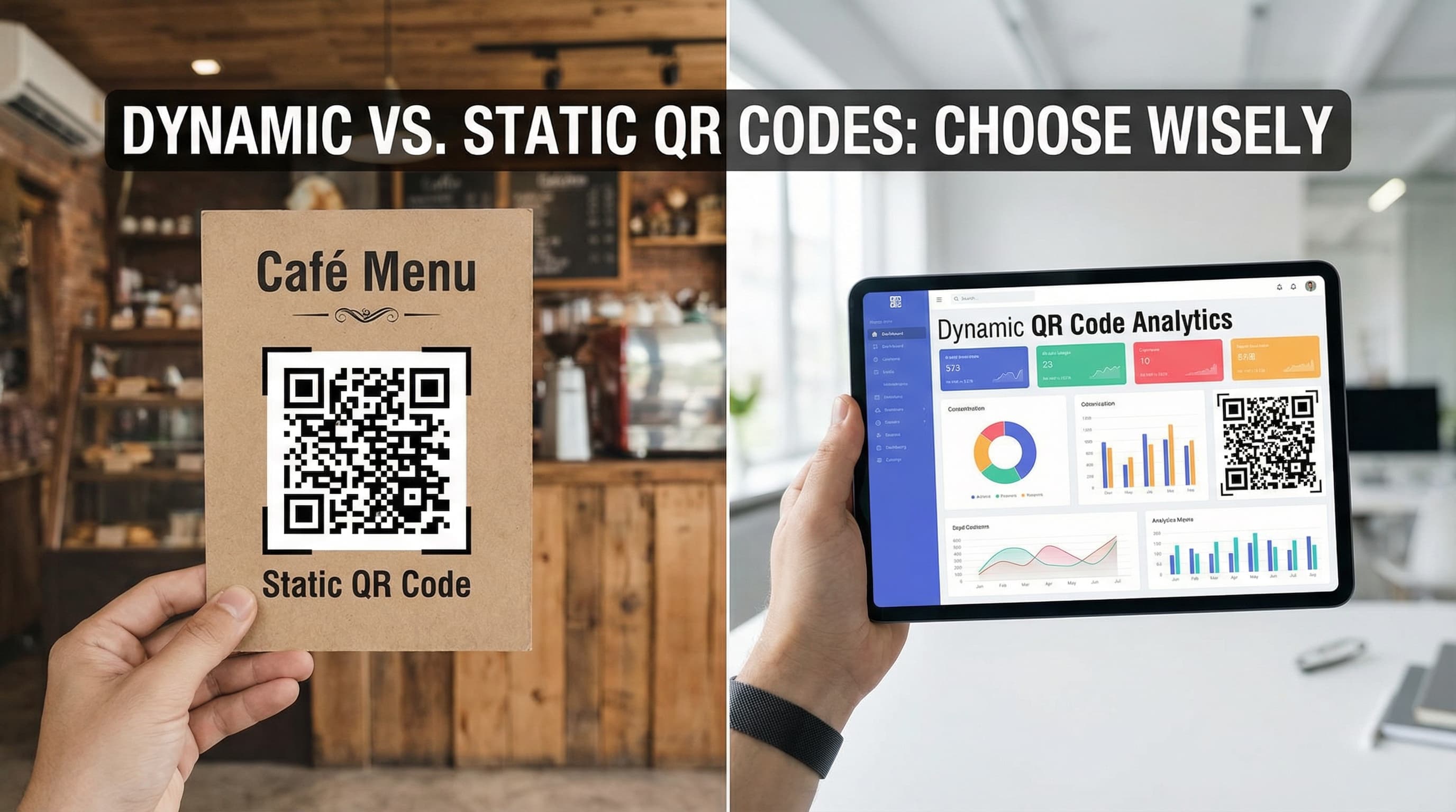
**Trend 2026:** Many restaurants now use dynamic QR codes that show different menus for breakfast/lunch/dinner automatically based on scan time.
Retail and E-commerce
**Challenge:** Codes appear on packaging, displays, and advertisements—must work at various distances and lighting.
**Solution:**
**Example:** Nike might use:
Healthcare and Pharmaceuticals
**Challenge:** Critical information must be accessible to all users, including elderly or visually impaired patients.
**Solution:**
**Note:** In healthcare, reliability trumps aesthetics every time.
Luxury Brands
**Challenge:** Maintain premium aesthetic while providing functionality.
**Solution:**
**Example:** A luxury watch brand might use:
Events and Entertainment
**Challenge:** Codes must work in dynamic environments with varying light and crowd conditions.
**Solution:**
**Trend 2026:** Concert venues use animated QR codes on screens that refresh every 30 seconds to prevent ticket fraud.
Technical Specifications for Designers
File Format Guide
**For Digital Use:**
**For Print:**
Resolution Requirements
**Digital Screens:**
**Print Materials:**
**Size Calculation:**
For print: Desired physical size (in inches) × DPI = Required pixel dimensions
Example: 2-inch code at 300 DPI = 600 x 600 pixels
Testing and Quality Assurance
The 7-Point QR Code Test
Before deploying your QR code, verify:
1. **Multi-Device Compatibility**
Test on:
- iPhone (latest and 2 generations back)
- Android (Samsung, Google Pixel, Xiaomi)
- Different QR scanner apps
2. **Distance Testing**
Verify the code works at:
- Close range (10 cm)
- Normal range (30 cm)
- Expected viewing distance
- Maximum practical distance
3. **Lighting Conditions**
Test in:
- Bright sunlight (glare test)
- Normal indoor lighting
- Low light conditions
- With phone flashlight
4. **Damage Simulation**
Cover portions of the code:
- 10% obscured (Level L test)
- 20% obscured (Level M test)
- 30% obscured (Level H test)
5. **Print Quality Check**
If printing:
- Verify no pixelation at actual size
- Check contrast matches screen version
- Ensure quiet zone is preserved
- Test scan from printed sample
6. **Landing Page Verification**
Ensure:
- Page loads in under 3 seconds
- Content is mobile-optimized
- Value proposition is clear
- No broken links or errors
7. **Analytics Confirmation**
For dynamic codes:
- Test scan registers in dashboard
- Location data is captured
- Device types are tracked
Common Design Mistakes and How to Fix Them
Mistake 1: Logo Too Large
**Problem:** Code won't scan; logo obscures too much data
**Solution:** Reduce logo to 15-20% of code area; increase error correction to Level H
Mistake 2: Poor Contrast
**Problem:** Light gray on white or similar combinations
**Solution:** Test with grayscale filter; ensure 70%+ brightness difference
Mistake 3: Missing Quiet Zone
**Problem:** Text or graphics touch the code edge
**Solution:** Add minimum 4-module white border around entire code
Mistake 4: Over-Customization
**Problem:** Too many colors, shapes, or effects reduce reliability
**Solution:** Simplify; prioritize scanning over aesthetics
Mistake 5: Wrong Error Correction Level
**Problem:** Using Level L when logo is added
**Solution:** Always use Level H when customizing codes
Advanced Design Techniques for 2026
AI-Assisted QR Code Design
New tools use artificial intelligence to:
Animated QR Codes
For digital displays, consider animated QR codes that:
**Important:** Animation must not interfere with the code's structure. The finder patterns should remain static.
Personalized QR Codes
Some advanced platforms now offer:
Design Tools and Resources
Professional QR Code Generators
**QRminds (Recommended)**
**Adobe Illustrator + QR Plugins**
**Canva Pro**
Color Contrast Checkers
Testing Tools
Step-by-Step: Creating Your Branded QR Code
Follow this process for professional results:
Step 1: Define Your Goal
Step 2: Choose Content Type
Step 3: Select Error Correction Level
Step 4: Design Your Code
Step 5: Export in Multiple Formats
Step 6: Comprehensive Testing
Step 7: Deploy and Monitor
The Future of QR Code Design
Emerging Trends
**1. Shape-Shifting Codes**
Research is ongoing into QR codes that can change shape while maintaining functionality—potentially allowing for truly organic, non-square designs.
**2. Holographic Integration**
Physical products may soon feature holographic QR codes that are only visible from certain angles, adding security and aesthetic appeal.
**3. Biometric-Linked Codes**
QR codes that incorporate biometric verification, ensuring only authorized users can access the linked content.
**4. Environmental Responsiveness**
Codes that automatically adjust their design based on ambient light, ensuring optimal contrast in any condition.
Conclusion
QR code design is where functionality meets creativity. A well-designed code doesn't just work—it invites interaction, reinforces your brand, and creates a seamless bridge between physical and digital experiences.
Remember the fundamental principles:
With the techniques in this guide, you can create QR codes that are not only highly functional but also beautiful brand assets that users want to scan.
Ready to design your perfect QR code? Start with QRminds' professional QR code generator and bring your creative vision to life.
Frequently Asked Questions
Can I put my logo in a QR code?
Yes, you can add a logo to the center of your QR code. Keep it under 30% of the total area (15-20% is ideal), use error correction Level H, and ensure the logo has high contrast against a white background. Always test thoroughly after adding a logo.
What colors work best for QR codes?
The most reliable color combination is black on white. For branded codes, use dark colors (navy, dark green, purple) on white backgrounds. The key is contrast—there should be at least 70% difference in brightness between the code and background. Avoid yellow on white, light gray on white, or similar low-contrast combinations.
What's the minimum size for a QR code with a logo?
QR codes with logos should be larger than standard codes to ensure reliability. For print: minimum 3x3 cm. For digital: minimum 300x300 pixels. The increased size compensates for the data obscured by the logo.
Do custom QR codes scan as well as standard black and white ones?
Properly designed custom QR codes scan nearly as well as standard ones (95-98% success rate vs. 99%). The key is following best practices: maintain high contrast, don't over-customize, use appropriate error correction levels, and always test before deployment.
Can I use gradients in my QR code design?
Gradients are not recommended for QR codes as they create areas of low contrast that scanners may not read reliably. If you must use gradients, keep them very subtle, ensure all areas maintain 3:1 contrast ratio, and test extensively. Solid colors are always safer.